Brand Suprcon simulates the nature of the business to assist companies and entrepreneurs through management consultancy, positioning them more effectively in the market.
Suprcon's brand DNA adds a touch of humor. To a significant extent, Suprcon embodies the delivery of their expertise, aiding various companies and individuals in need. They position themselves as "superheroes" through their services, knowledge, and distinctive approach.
The primary challenge was to encapsulate the brand philosophy and bridge the gap between strategy and visualization succinctly, while maintaining clear visuals that convey the underlying concept.
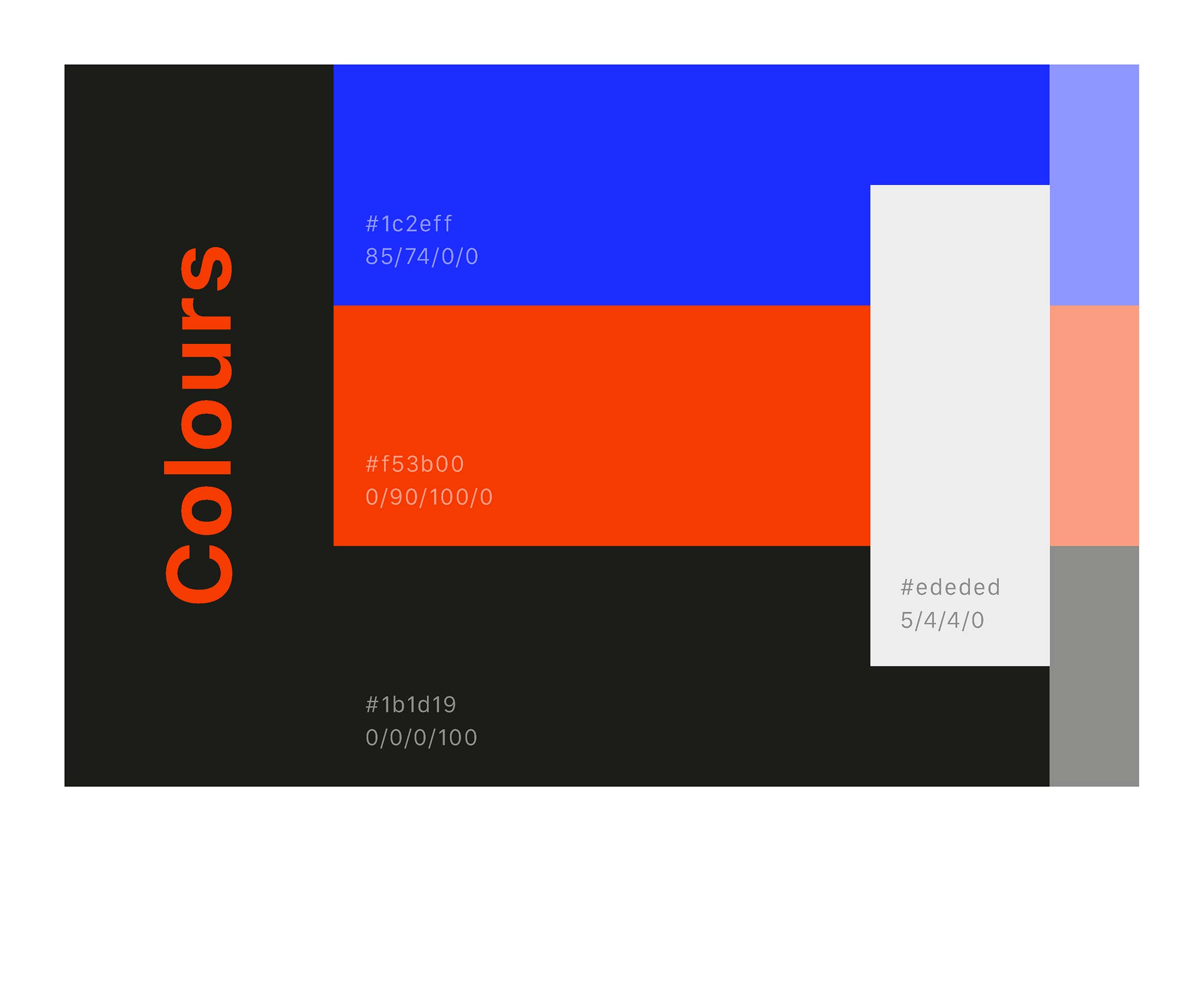
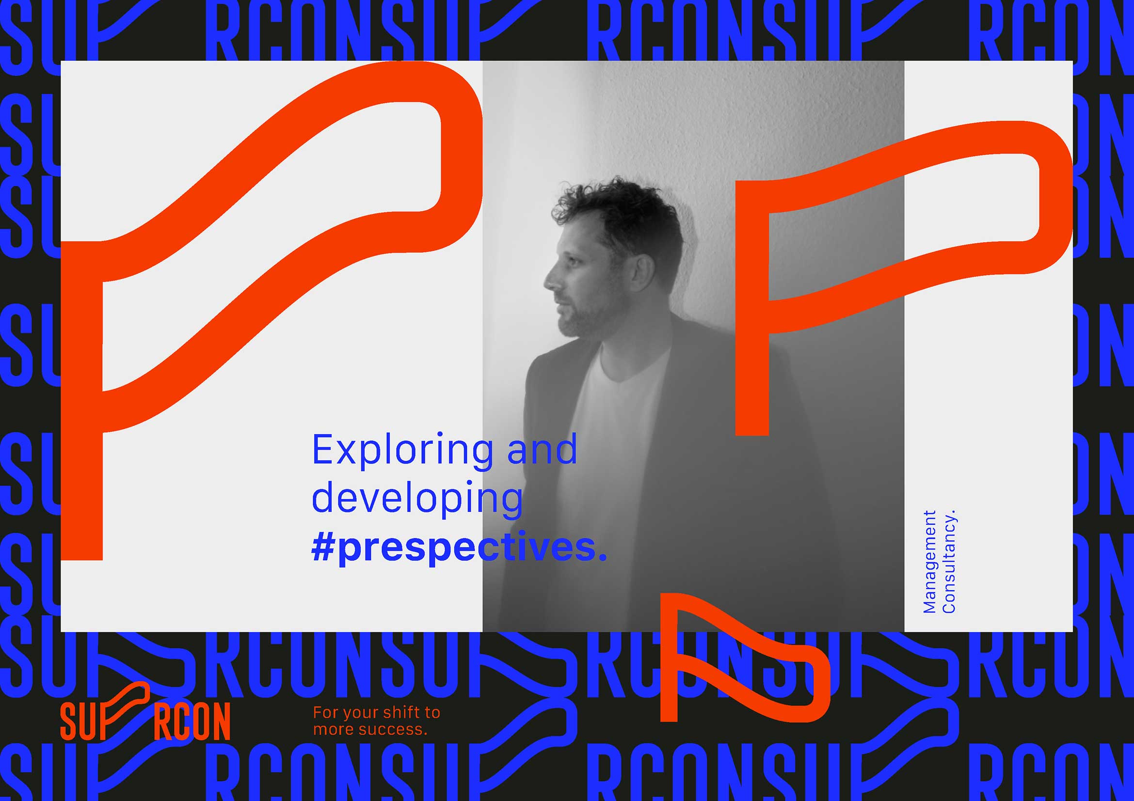
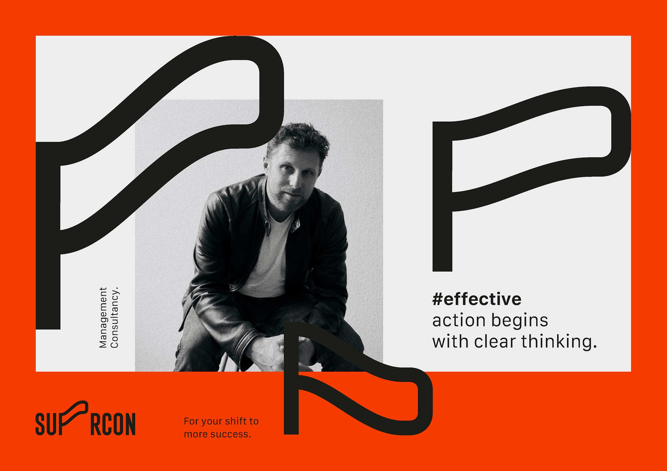
Suprcon's logotype mimics the fluttering of a "hero cape," imbuing the brand with uniqueness and freshness.
The solution involved creating three distinct logos unified by a common design language, with the letter "P" crafted to resemble a superhero's cape. Each of these logos serves as a primary identifier, adapted for various marketing materials and online communications. When viewed collectively, these elements create a visual effect reminiscent of a waving hero's cape, effectively encapsulating the brand's strategy and DNA.
ClientP.M. Digital Business ConsultingServicesConsulting, Creative direction and Brand developmentLinkhttp://www.suprcon.com